【翻译】CSS3媒体查询(CSS3 Media Queries)
CSS2允许你为不同的媒体类型(比如屏幕或打印)设置不同的样式。现在CSS3通过增加了媒体查询(media queries)这一属性,使其变得更为高效。你可以在媒体类型中添加表达式来检查不同的条件添加不同的样式。例如,你可以为大显示器使用一种样式,为移动设备使用另一种样式,这是相当有用的,因为它允许你在不改变内容的情况下,为不同的分辨率和设备量体裁衣。继续阅读本文的教程和一些很好利用了媒体查询的网站。
CSS3媒体查询 (CSS3 Media Queries)
查看我的DEMO,调整你的浏览器窗口看它的实际效果。
最大宽度(Max Width )
The following CSS will apply if the viewing area is smaller than 600px.
下面的CSS将在屏幕的视区宽度小于600像素的时候起作用。
@media screen and (max-width: 600px) {
  .class {
    background: #ccc;
  }
}
If you want to link to a separate stylesheet, put the following line of code in between the <head> tag.
如果你想链接到一个单独的样式,把下面的代码放到<head>标签中就可以了。
<link rel="stylesheet" media="screen and (max-width: 600px)" href="small.css" />最小宽度(Min Width )
The following CSS will apply if the viewing area is greater than 900px.
下面的CSS将在屏幕的视区宽度大于900像素的时候起作用。
@media screen and (min-width: 900px) {
  .class {
    background: #666;
  }
}
多个媒体查询(Multiple Media Queries )
You can combine multiple media queries. The following code will apply if the viewing area is between 600px and 900px.
你可以结合多个媒体查询,下面的CSS将在屏幕的视区宽度在600像素到900像素之间的时候起作用。
@media screen and (min-width: 600px) and (max-width: 900px) {
  .class {
    background: #333;
  }
}
设备宽度(Device Width )
The following code will apply if the max-device-width is 480px (eg. iPhone display). Note: max-device-width means the actual resolution of the device and max-width means the viewing area resolution.
下面的CSS将在max-device-width为480像素的时候起作用(比如iPhone的屏幕)。注:max-device-width指的是设备的实际分辨率,max-width指的是可视区域的分辨率。
@media screen and (max-device-width: 480px) {
  .class {
    background: #000;
  }
}
对于iPhone4(For iPhone 4 )
The following stylesheet is specifically for iPhone 4 (credits: Thomas Maier).
下面的CSS是专门为iPhone4设计的。(credits: Thomas Maier).
<link rel="stylesheet" media="only screen and (-webkit-min-device-pixel-ratio: 2)" type="text/css" href="iphone4.css" />对于iPad(For iPad )
You can also use media query to detect orientation (portrait or landscapse) on the iPad (credits: Cloud Four).
你还可以在iPad使用媒体查询检测方位(头像或是风景)(credits: Cloud Four).
<link rel="stylesheet" media="all and (orientation:portrait)" href="portrait.css">
<link rel="stylesheet" media="all and (orientation:landscape)" href="landscape.css">
对于IE浏览器的媒体查询(Media Queries for Internet Explorer)
Unfortunately, media query is not supported in Internet Explorer 8 or older. You can use Javascript to hack around. Below are some solutions:
很遗憾,只有IE8+的IE浏览器才支持媒体查询,你可以通过JS来解决这个BUG,如下是一些解决方案。
- CSS Tricks - using jQuery to detect browser size
- The Man in Blue - using Javascript (this article is written 6 years ago)
- jQuery Media Queries Plugin
示例网站(Sample Sites )
You need to view the following sites with a browser that supports media queries such as Firefox, Chrome, and Safari. Go to each site and see how the layout responds base on the size of your browser winow.
你需要在支持媒体查询的浏览器(如火狐,谷歌和Safari)中查看这些网站,去每个站点查看看随着浏览器大小改变时的页面布局的响应。
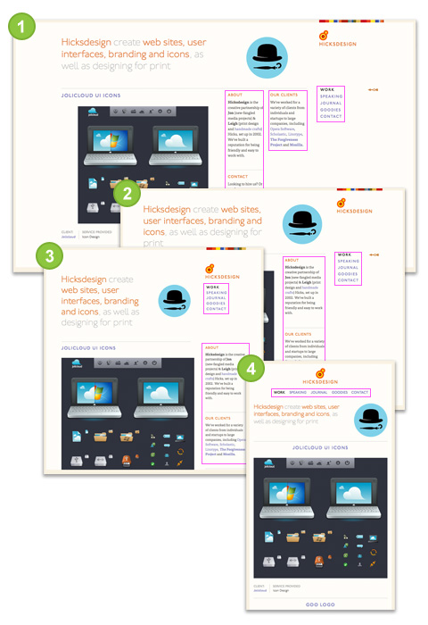
Hicksdesign
- Large size: 3 columns sidebar
- Smaller: 2 columns sidebar (the middle column drops to the left column)
- Even smaller: 1 column sidebar (the right column shift up below the logo)
- Smallest: no sidebar (logo & right column shift up and the other sidebar columns move below)
- 大尺寸: 3列侧边栏
- 小: 2列侧边栏(中间栏下降到左边的列)
- 更小: 1列侧边栏(右列标志下方转移)
- 最小:没有侧边栏(logo及右列上移,另一侧边栏移动到下方)
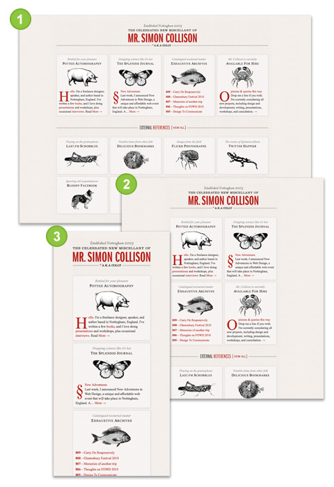
Colly
The layout switches between one column, 2 columns, and 4 columns depend on the viewing area of your browser.
下面的布局会根据你的浏览器可视范围在一栏,两栏和四栏之间转换。
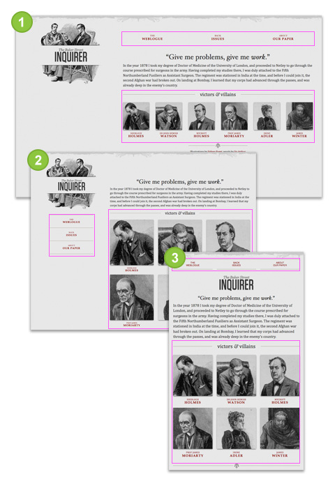
A List Apart
- Large size: navigation at the top, 1 row of pictures
- Medium size: navigation on the left side, 3 columns of pictures
- Small size: navigation at the top, no background image on logo, 3 columns of pictures
- 大尺寸:导航在顶部,1排图片
- 中型:导航在左侧,3列图片
- 体积小:导航在顶部, LOGO没有背景图像,3列图片
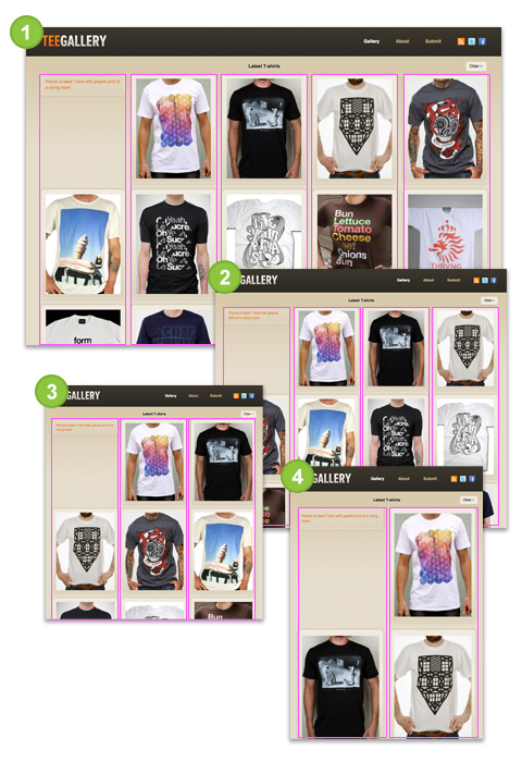
Tee Gallery
This one is very similar to previous example Colly, but the difference is the images of TeeGallery resize as the layout stretchs. The trick here is use relative percentage value instead of fixed pixel (ie. width=100%).
这个和前面的例子Colly非常相似,但不同的是TeeGallery的图像随着布局改变自动调整大小。这里的技巧是使用相对固定像素值,而不是百分比(即宽度= 100%)。
结论(Conclusion)
Keep in mind: having an optimized stylesheet for mobile devices doesn't mean your site is optimized for mobile. To be truly optimized for mobile devices, your images and markups need to cut on the load size as well. Media queries are meant for design presentation, not optimization.
请记住:有一个为移动设备优化的样式表并不意味着你的网站对于移动设备来说就是优化的。真正的做到为移动设备优化,你需要减小的图像和标记的加载大小。媒体查询是用来设计zhanxi形式的,而不是优化。
【原文地址】http://webdesignerwall.com/tutorials/css3-media-queries
【参考实例】http://mediaqueri.es/


